La Casita Mercado

Professor: Paul Kepple
Branding |  Bilingual Design | Advertising Design | Signage
La Casita Mercado is a culturally rooted grocery store concept inspired by Latin American flavors, traditions, and community values. This brand was created to reflect the warmth and familiarity of a neighborhood mercado while delivering a cohesive visual identity system that works across signage, packaging, in-store materials, and bilingual communication.From logo design and custom patterns to a weekly printed circular and food packaging mockups, every element was designed to feel bold but approachable, bright but thoughtful. While capturing the homemade comfort of shared meals and the pride of local culture. The project includes a full brand identity system, in-context print layouts, and real-world applications like grocery bags, print, and label design.

Logo Process

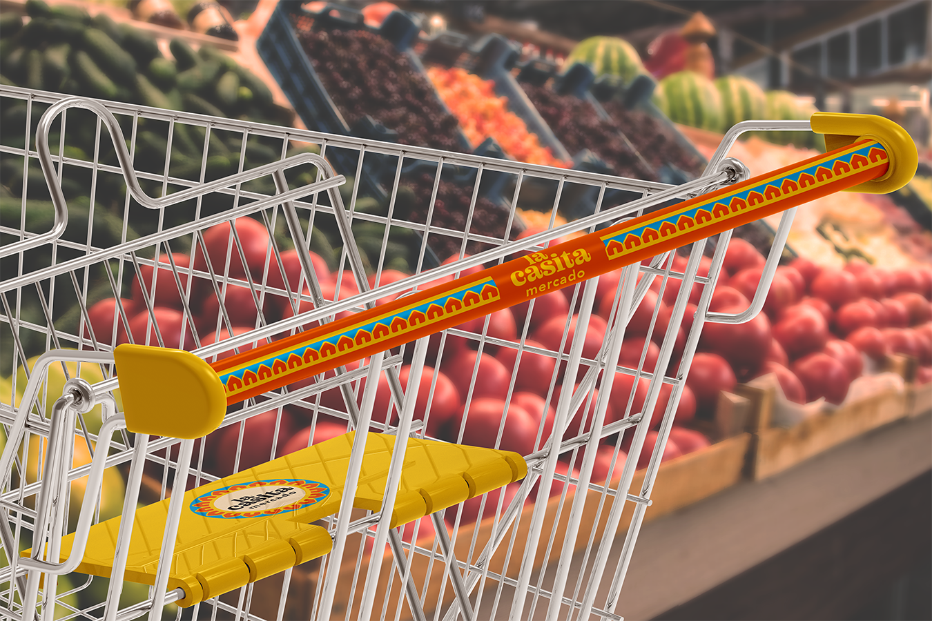
The logo for La Casita Mercado was designed to feel warm, inviting, and rooted in community. Early explorations leaned into round, dolly-like patterns to evoke softness and tradition, but they lacked clarity and connection. The breakthrough came when I focused on the name itself—“La Casita”—and explored how the idea of a home could be used both symbolically and structurally in the design.
By incorporating a small house as the central icon and arranging supporting shapes around it, the logo naturally evolved into a radial form that resembled a rising sun. This combination of structure and softness created a mark that not only feels personal and approachable, but also becomes the foundation for patterns and supporting brand graphics throughout the identity system.

Brand Identity System

The brand identity for La Casita Mercado was designed to reflect homemade comfort, cultural pride, and a strong sense of community. Bright, bold colors were chosen to bring energy and warmth to the brand without feeling overwhelming or tacky.
At the heart of the system is a custom logo that uses a casita (little house) symbol to represent home, family, and tradition. This symbol is echoed in a secondary pattern used for branding accents, while a more detailed packaging pattern highlights staple Latin American dishes like pupusas, empanadas, and plátanos, paired with fresh ingredients like cilantro and tomatoes. These visual elements work together to create a brand that feels welcoming, familiar, and proudly rooted in culture.

Food Pattern

The food pattern features a series of vibrant vector illustrations, a mix of custom and curated Adobe assets to represent staple foods found across a variety of Latin American countries. Special care was taken to include ingredients from different cultures to create a sense of welcome and recognition for everyone. The pattern is mainly used on labels, packaging, and grocery bags to add warmth, energy, and cultural connection to everyday shopping.

Casita Logo Pattern

Pulled from the primary logo’s design of small homes, the casita pattern was adapted in two ways:• As a circular mark to emphasize community and belonging.• As a straight, repeating border for applications like shopping cart bars and shelf signage.The casita pattern also flexes by recoloring the homes to match different country flags, highlighting the diversity within the La Casita Mercado community.

Slogans & Brand Voice

Primary Slogan:
“Rooted in Tradition, Grown with Community”
This reflects the heart of the brand and is used across core applications like signage, bags, and community messaging.

Secondary (Food-Driven) Slogan:
“El Sabor Empieza Aquí” (The Flavor Starts Here)
Used on food packaging and displays, this slogan speaks directly to the cultural importance of flavor and tradition at the center of every meal.

Why a Circular?

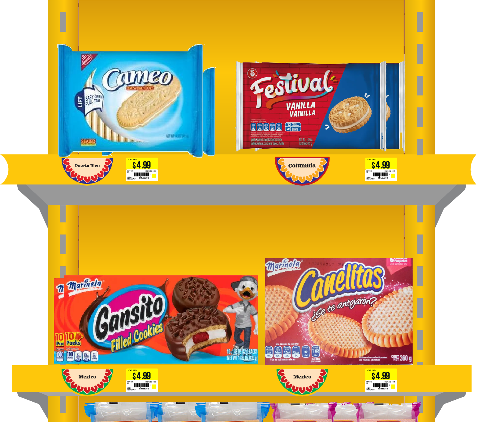
As part of creating a complete brand experience for La Casita Mercado, I designed a weekly circular. These print ads remain an essential part of communication in many Latino markets, where weekly specials and store updates are traditionally shared through flyers found in-store, in bags, or delivered to homes.

It’s important to recognize that for many latino families, print circulars are still a trusted and familiar way of shopping. It is often browsed at the kitchen table or passed along between relatives. They’re not just about deals; they’re about maintaining routine, sharing information, and staying connected.


The flyer also gives space to highlight community events, like tamale-making classes, which are a key part of the store’s identity. La Casita Mercado isn’t just a place to shop, it’s a space to gather, share traditions, and build community through food. At the bottom of the flyer, I featured a rotating hot bar spotlight, starting with a Dominican-inspired menu for the week. This allowed the circular to do more than advertise, it became a way to celebrate cultural diversity through food and invite customers to experience something new or nostalgic with each visit.

The store uniform uses the core La Casita Mercado color palette, with the main logo and slogan placed on the chest for immediate brand recognition. To tie in cultural storytelling, the pattern derived from the logo is used along the ridges of the short sleeves and the bottom hem of the apron. The design is inspired by traditional Latin American textile motifs, paying quiet homage to indigenous craftsmanship and ancestral roots.
The shopping basket uses the store’s primary brand colors for consistency and visibility. The La Casita Mercado logo appears on all sides, while the longer side features the main slogan

In-Store Brand Experience

A one-color blue version of the grocery bag, designed for plastic print applications. It features the same illustrated food pattern and slogan placement as the brown paper version, maintaining consistency across materials while adapting to store needs.
Designed for one-color print applications, this bag uses the simplified logo in brand orange for clarity and consistency. The illustrated food pattern wraps the base, while the slogan and website on the bottom subtly extend the brand into everyday use..
The shopping cart design features the store’s slogan across the handlebar, framed by the casita pattern on both sides. The backrest panel (where kids sit) carries the brand’s colors and iconography, turning even small in-store details into branded moments.
This ad space isn’t used for sales—it’s used for community. By dedicating it to ideas like a children’s birthday list or cultural shoutouts, it reinforces La Casita Mercado’s focus on being more than a store. Even the smallest spaces serve to reflect, support, and celebrate the people it serves.

Food Packaging


Two tortilla packages were developed, one for flour tortillas and one for corn tortillas with design choices made to support real shopper behavior. Each package uses a different background color in the pattern to help customers quickly tell them apart, making it easier to grab the right one at a glance. A bold "30 count" label is placed prominently on the corner, recognizing that shoppers often scan for quantity first when picking up staple items.

This is the kind of detail you only notice if you shop for yourself or if you really understand how your community shops. It’s a personal touch added from experience, making sure La Casita Mercado feels familiar, practical, and thoughtfully designed for the people it serves.
Features the ingredient pattern to highlight everyday flavor. General cuts use the store’s main logo, while regional dishes include country-specific variations.
This is some text inside of a div block.
Each bottle features a country-specific variation of the casita logo, using that nation’s flag colors. The brand name appears above the logo, while the country name and key ingredients are listed within the casita frame, replacing the usual logo text. This approach highlights cultural origin while maintaining brand consistency. For general items like the mango drink, the original La Casita logo and colors are used.

Environmental Branding

This section explores how La Casita Mercado’s identity extends beyond packaging and print—into the physical store environment. From bilingual aisle signage to culturally inspired shelving details, each element is designed to guide, welcome, and reflect the community it serves. These mockups show how thoughtful design can make even everyday spaces feel intentional, familiar, and rooted in tradition.

Aisle Wayfinding Signage

I started with a half-crescent shape for the aisle signs to reflect the rounded feel of the La Casita logo, but it didn’t quite work with the structure of the shelves. Eventually, I shifted to a T-shaped sign that let the logo sit on top while clearly listing what’s in the aisle underneath. Each sign includes both English and Spanish product names side by side, so it’s easy to understand no matter what language you speak. It’s a small way to make the store feel more welcoming and reflective of the community it serves.

Shelves

Small stickers placed on shelving edges use the La Casita logo pattern, recolored to match the flag of the country the product is from or inspired by. These subtle markers help celebrate cultural origin and make it easier for shoppers to explore flavors by region.
Shelf mockup showcasing how flag-based stickers integrate seamlessly into real store shelving, adding cultural context at the point of selection.

End Aisles

This paper display stand features the brand’s illustrated food pattern and bright surface colors to draw attention in-store to certain products. The main logo is placed prominently, while the secondary slogan, “El Sabor Empieza Aquí,” translates to "The Flavor Starts here" is used to speak directly to the food experience, reminding customers that the flavor truly starts with these products.
Designed for high visibility and cultural warmth. The branded shelf display reinforces familiarity and tradition with the casita-patterned backdrop and stacked tortilla packaging. Set in a grocery aisle, this setup captures how Mi Casita Mercado meets customers with warmth and clarity at the point of purchase.

Get in touch! I'm here to help.
‍¡Contáctame! Estoy aquí para ayudar."

Tell me about your project, inquiry, or just say hello!
‍Cuéntame sobre tu proyecto, consulta o simplemente salúdame.

Thank you! Your submission has been received!
Oops! Something went wrong while submitting the form.