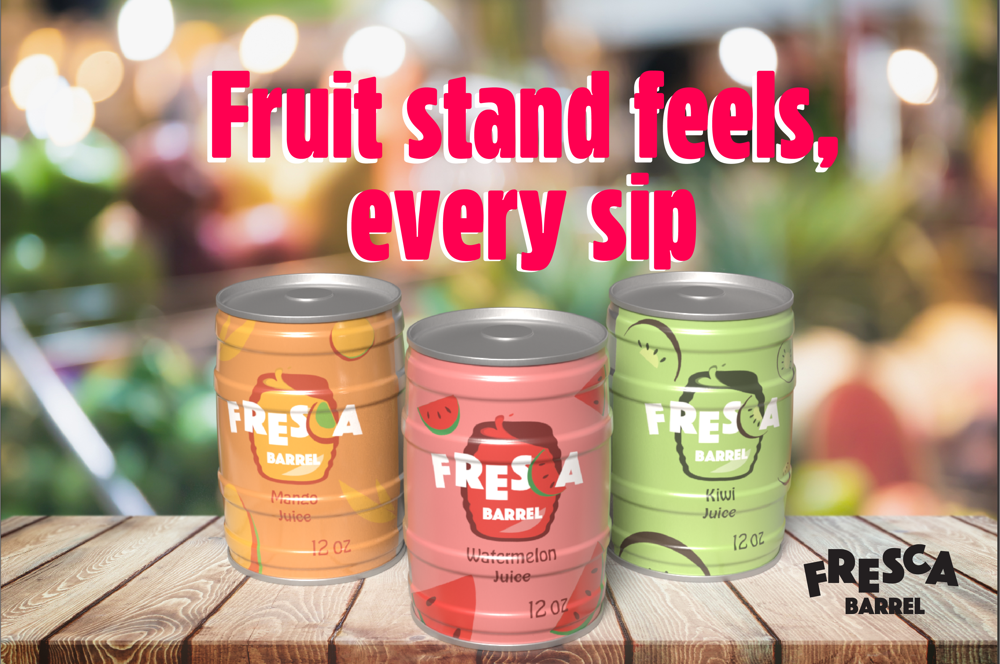
I found it important to find or make a rendering of a barrel. The fresh fruit juices in Latin America and in Latino restaurants in the US serve fresh juices in these containers. Transclucent, they show the vibrancy of the fruits used in these elixers.
The design started with just the name itself, but over time it evolved to feel bolder and more eye-catching. I increased the font weight to make it stand out more, but it still didn’t feel fun enough for the product. To bring in more personality, I incorporated fruit imagery based on the flavors of the juice. For advertisements, when fruit isn't used, the "C" tucks back into the word "FRESCA," keeping the logo clean and flexible across different uses.
I did a vector of a barrel as agua frescas are usually sold in those shapes. As I played with the font, I played with the color schemes. I took in consideration the pattern the rendering would have and so decided on a dark outline of the barrel.